Over the past few months, I've learned a bit about creating modern websites. As I embark on a new venture to build a movie app similar to Netflix, I plan to blog about any major milestones in this project.
Prerequisites
- If you are using my next-starter:
- You're all set to go!
2.If you are not using my next-starter:
- Set up Shadcn
- Add an icon library of your choice.
You can find my next-starter here
If you are someone experienced you can straight away have a look at the source code here Let's start by creating the navbar. While making a navbar might seem simple, following certain steps can ensure consistency across all your applications.
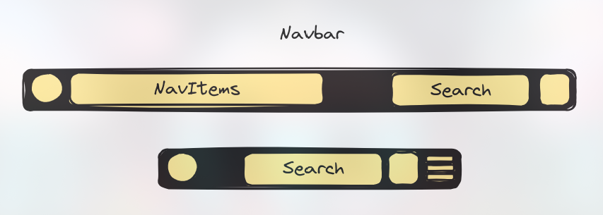
Step 0 (Optional): Design Your Navbar
Working with a design in hand has always been my preferred method. You can use any design software of your choice; I use Excalidraw.
Step 1: Determine What You Need in Your Navigation Bar
Having a cluttered navbar is not ideal; try to keep it minimal. In my application, the navbar includes the following items: [Home, Movies, TV Shows, Anime, People, Trending]. Let's first create the data for the navbar.
- Create a site config file:
export type NavItem = {
  title: string;
  href: string;
  icon: IconType; // This will differ depending on the icon library
};

const home = {
  title: "Home",
  href: "/",
  icon: FaHome,
};

const movies = {
  title: "Movies",
  href: "/movie",
  icon: MdLocalMovies,
};

const tvShows = {
  title: "TV Shows",
  href: "/tv-show",
  icon: PiTelevision,
};

const anime = {
  title: "Anime",
  href: "/anime",
  icon: GiBlackKnightHelm,
};

const people = {
  title: "People",
  href: "/people",
  icon: FaUser,
};

const trending = {
  title: "Trending",
  href: "/trending",
  icon: IoMdTrendingUp,
};export const navItems = {
items: [home, movies, tvShows, anime, people, trending] as NavItem[]
}Now, export these as an array of NavItem
Step 2: Create a Navbar Component
I will be using Shadcn's Navbar Component. If you want to use it too, run the following command in the terminal:
ts pnpm ui:add navigation-menu The navigation-menu structure follows this hierarchy:
<NavigationMenu>
  <NavigationMenuList>
    <NavigationMenuItem>
    </NavigationMenuItem>
  </NavigationMenuList>
</NavigationMenu>
Since we will be using links to redirect the user to different routes, we should create a new SiteNavItem component to function as a navigation link:
const SiteNavItem = ({ title, href, icon }: NavItem) => {
  const isActive = useActiveNav(href);
  const Icon = icon;
  return (
    <NavigationMenuItem>
      <Link href={href} legacyBehavior passHref>
        <NavigationMenuLink
          className={cn(
            navigationMenuTriggerStyle(),
            isActive && "bg-accent",
            "gap-2 text-lg",
          )}
        >
          <Icon />
          {title}
        </NavigationMenuLink>
      </Link>
    </NavigationMenuItem>
  );
};
useActiveNav is a custom hook that checks whether the current path matches the href param, helping to achieve the active item effect:
"use client";
import { usePathname } from "next/navigation";

export const useActiveNav = (href: string) => {
  const pathname = usePathname();
  if (href === "/") return pathname === href;
  return pathname.startsWith(href);
};
Now, if you check how it looks, it should resemble the intended design.

Step 3 Layout the design
Depending on how you designed your Header you can now start implementing that design In my case I just added a Home icon ,search input,modeToggle around my navbar
const SiteHeader = () => {
return (
<div className="sticky mx-auto w-full border-b bg-background md:container">
<div className="flex h-14 items-center">
<SiteNav />
<div className="mr-4 flex justify-end space-x-2">
<Input className="min-w-full" placeholder="Search" />
<ThemeToggle />
</div>
</div>
</div>
);
};
export default SiteHeader;
</PreCard>
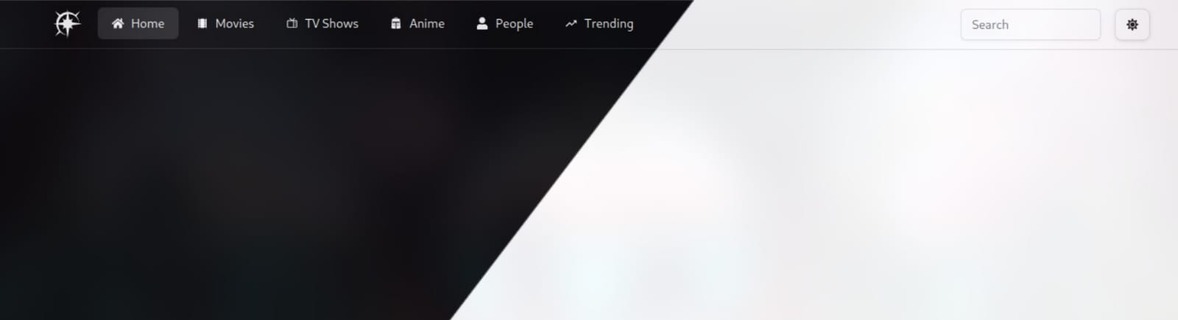
So now my header looks like

So the last thing left to do is to adapt the design for other screen sizes
## Step 4: Make the Navbar Responsive
We will design the hamburger menu in a similar fashion but this time we will be using the drawer component from shadcn so run
{" "}
<PreCard pwd="shell">```ts pnpm ui:add drawer ```</PreCard>
Similarly create the menuItems
<PreCard pwd="src/components/header/site-menu.tsx">
```ts
const SiteMenuItem = ({ title, href, icon }: NavItem) => {
const Icon = icon;
const isActive = useActiveNav(href);
return (
<Link href={href} passHref>
<Button
variant={"ghost"}
className={cn(
isActive && "bg-accent",
"flex w-full flex-col items-start justify-start gap-3 space-x-4 font-semibold text-primary",
)}
>
<div className="flex items-center justify-center gap-3">
<Icon />
{title}
</div>
</Button>
</Link>
);
};Now create the hamburger menu
pnpm ui:add drawerconst SiteMenu = () => {
return (
<Drawer>
<DrawerTrigger asChild>
<Button className="flex items-center md:hidden" variant={"outline"}>
<GiHamburgerMenu />
</Button>
</DrawerTrigger>
<DrawerContent>
<DrawerHeader>
<DrawerTitle>Menu</DrawerTitle>
<DrawerDescription>
Explore the world of movies and TV shows.
</DrawerDescription>
</DrawerHeader>
{navItems.items.map((item) => (
<SiteMenuItem
key={item.title}
title={item.title}
href={item.href}
icon={item.icon}
/>
))}
</DrawerContent>
</Drawer>
);
};Now fit the menu in the header component
const SiteHeader = () => {
  return (
    <div className="sticky mx-auto w-full border-b bg-background md:container">
      <div className="flex h-14 items-center">
        <SiteNav />
        <div className="mr-4 flex justify-end space-x-2">
          <Input className="min-w-full" placeholder="Search" />
          <ThemeToggle />
          <SiteMenu />
        </div>
      </div>
    </div>
  );
};
export default SiteHeader;
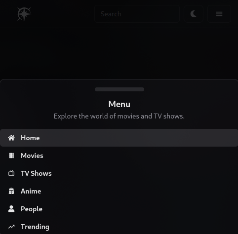
Looks Good!
Feel free to reach out to me on LinkedIn or Twitter if you have any questions or suggestions. I'm always open to feedback. You can find all my links here Linkotree